How to design publication-type maps using Google Maps and R
How to Design Publication-type Maps Using Google Maps and R
The statistical software R has become a widely used tool in science these days. It is free of charge, it is easy to use and it is very flexible. One of its flexibility features is the ability to create geographical maps using Google Maps (and also plotting/overlaying data on maps).
Here, I would like to illustrate how to create a map showing weather station points in Norway on a Google Map. I will also show you how to save the map in high-resolution, so that you can use it in a publication or report. This is adapted from a plot I created for the HORDAKLIM Project, managed by Dr. Erik Kolstad at Uni Research Climate in Norway.
Installing R
If you do not have R on your machine, it is very easy to install it. You just download it from its main website at www.r-project.org and follow the instructions there. I personally like to work with an R interface called RStudio (Fig. 1), which you can download here: www.rstudio.com
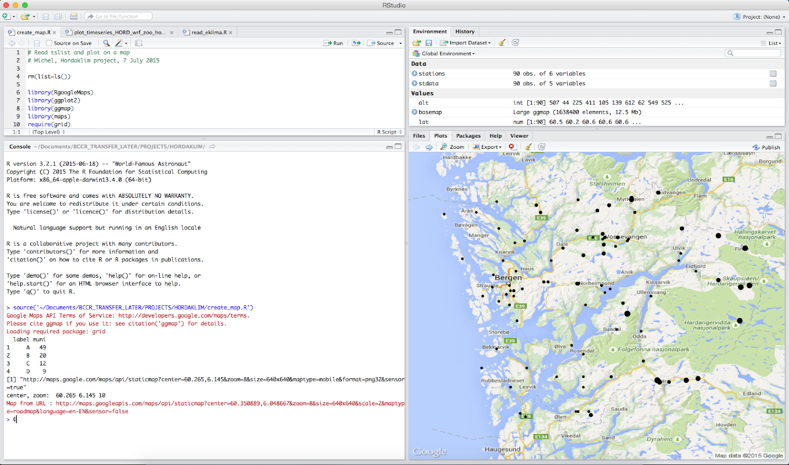
Figure 1 – Screenshot of R studio, showing a map with weather station points, where the size of the points are scaled according to the altitude of the station.
R packages you will need
In order to create the plots in this tutorial, you will need to download and load a few of packages in R. This is straightforward to do. After you open R (or RStudio), type the following there:
install.packages(“RgoogleMaps”)
install.packages(“ggplot2”)
install.packages(“ggmap”)
install.packages(“grid”)
Now that they are installed, you don’t need to install them again. But you will need to load them whenever you use them. So, let’s load these packages to get started:
library(RgoogleMaps)
library(ggplot2)
library(ggmap)
require(grid)
Data for this tutorial
We will create some data for the tutorial. The data contain the names of the stations, the latitude, the longitude and their altitude. If you prefer, you can also read the data from a text file. But here, we will do it directly in R. Note: the hashtag (#) below is used for comments.
# Create data
station<-c("Kaldestad", "Folgefonna", "Nesttun", "Flesland", "Midstova")
lat<-c(60.55,60.22,60.32,60.29,60.66)
lon<-c(6.02,6.43,5.37,5.23,7.28)
altitude<-c(507,1390,62,48,1162)
# Create data frame
stdata<-data.frame(sta=station, lat=lat, lon=lon, alt=altitude)
print(stdata)
Classifying data into categories
We will classify our stations into four different categories. These are needed so that we can plot points with different sizes based on the station altitude. We will classify them as stations that are below 100m, between 100m and 600m, between 600m and 1200m and above 1200m.
# classify altitude into 4 categories
stdata <- within(stdata, {
label <- NA
label[alt > 0 & alt <= 100] <- "A"
label[alt > 100 & alt <= 600] <- "B"
label[alt > 600 & alt <= 1200] <- "C"
label[alt > 1200] <- "D"
})
# check the data with the classification
print(stdata)
Making the first map
Now, we are ready to make our first map (Figure 2). We will create the map based on the latitude and longitude information from our dataset. The option zoom below can be changed, so that you can see closer or further away. So, type the following:
# Making maps
MyMap <- MapBackground(lat=lat,lon=lon,zoom=10)
# Plot character size determined by altitude
tmp <- altitude
tmp <- tmp - min(tmp) # remove minimum
tmp <- tmp / max(tmp) # divide by maximum
PlotOnStaticMap(MyMap,lat,lon,cex=tmp+0.8,pch=16,col='black')
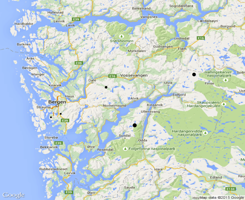
Figure 2 – First map showing the five stations. The size of the stations are based on their altitude.
Second plot
Our second plot will be a bit more sophisticated, as we will use the ggplot2 package. Also, we will add a legend to the size of the stations (Figure 3). Here’s how we do that:
# Another way of plotting
basemap <- get_map(location=c(lon=mean(lon),lat=mean(lat)), zoom = 8, maptype='roadmap', source='google',crop=TRUE)
ggmap(basemap)
map1 <- ggmap(basemap, extent='panel', base_layer=ggplot(data=stdata, aes(x=lon, y=lat)))
# map showing point size based on altitude
map.alt <- map1+geom_point(aes(size=stdata$alt),color="darkblue")+scale_size(range=c(2,9),breaks=c(10,100,500,1000))
# add plot labels
map.alt <- map.alt + labs(x ="Longitude", y="Latitude", size = "Altitude")
# add title theme
map.alt <- map.alt + theme(plot.title = element_text(hjust = 0, vjust = 1, face = c("bold")))+theme(legend.position="bottom")
print(map.alt)

Figure 3 – map using ggplot2, which adds a legend related to the station altitude in meters.
Making a plot for a publication
Finally, if you want to save your plot in high-resolution for a publication (e.g.: 600 dpi), you can do the following:
# Map for a publication
# Plot based on altitude category
tiff("station_map.tif", res=600, compression = "lzw", height=4.8, width=4, units="in")
map.cat <- map1+geom_point(aes(size=stdata$alt,group=stdata$label,
color=stdata$label))+scale_size(breaks=c(50,500,1000))
# manual color
map.cat <- map.cat+scale_colour_manual(values=c("#D55E00", "darkmagenta", "#0072B2","#009E73"),
breaks=c("A", "B", "C","D"),
labels=c("Coast", "Hill", "Mountain","High Mountain"))
# add plot labels
map.cat <- map.cat + labs(x ="Longitude", y="Latitude", size = "Altitude", color="Location")
# add title theme
map.cat <- map.cat + theme(legend.text = element_text(hjust = 0, vjust = 1,face = c("plain"),size=5),
legend.position="bottom",legend.box="vertical",legend.title=element_text(size=6),
legend.key = element_blank(), # remove gray background from legend
axis.text=element_text(size=6),axis.title=element_text(size=6))+
theme(plot.margin = unit(x=c(0.1,0.1,0,0.1),units="in")) # ("left", "right", "bottom", "top") # remove extra margins in fig
print(map.cat)
dev.off()
The result is shown in Figure 4. Note that in this plot, we have added the location type and the altitude as legends in the plot.

Figure 4 – Station plot on Google Map and two types of legend: location type and altitude
I hope you have enjoyed this tutorial. If you have further questions, you are welcome to post them here.
Acknowledgements
We thank the Yarker Consulting, m2lab.org and the HORDAKLIM Project for making this work possible. Also, we are very grateful for Google, R, RStudio, ggplot2 and others for making their software and packages freely available!
-Michel